Agricultural social science research is such an interesting job. When you get into exploratory diagnosis of agricultural innovation systems, you get to use many interesting visualization tools that are colorful and fun, but also powerful for synthesizing and analyzing data.
I was in Zimbabwe recently assisting with formative research on the Zimbabwe Agricultural Knowledge and Innovation System project, supported by the European Commission and implemented by a number of nongovernmental organizations including Welthungerhilfe and SNV. The project will establish two physical “agricultural centers of excellence”—sites that connect, showcase, and disseminate cutting edge research and dynamic agricultural education, linked directly into extension, farmer field trials, and feedback systems.
Prior to project design, we spent several weeks interviewing key stakeholders and holding focus group discussions with farmers, college lecturers, and extension and research personnel. The purpose of this initial research was to assess the status and needs of agricultural innovation system actors in Zimbabwe. We asked questions about what has worked in the past and is currently working in agriculture research, education, and extension.
Then, during our two-day “pit stop,” we used several tools to explore the stacks of data that we collected from more than 40 interviews. These included the mind map, a fishbone diagram, and a net-map.
With a mind map, participants diagram the main themes and sub-themes—and the connections between them—that begin to emerge in the qualitative data. For instance, the term “capacity” kept coming up, and related to capacity were sub-themes such as low competency, understaffing, and ad hoc in-service. The mind map allowed us to come to consensus on main themes, categorizations, sub-themes and examples. It gave us a shared “big picture” of the ground covered in interviews. Big emerging themes from the mind map included resource issues, capacity of personnel, coordination, and organizational change.
Kristin Davis/IFPRI
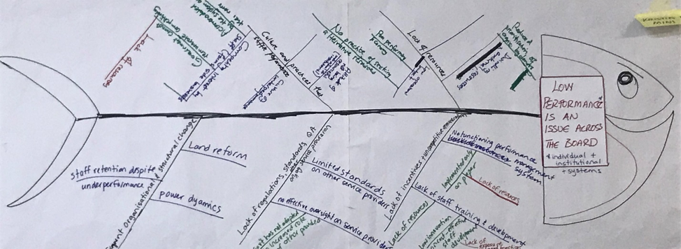
The fishbone or Ishikawa diagram then allowed us to break the issues down to draw out root causes or related causes from the information gathered in the mind map. For instance, we stated that “low performance is an issue.” We then asked “why?” One answer was the lack of incentives for personnel. We again asked “why?” We answered that it was due to a non-functioning system of performance management, which was in turn due to lack of resources. That allowed us to get to the root of the problem.
Kristin Davis/IFPRI
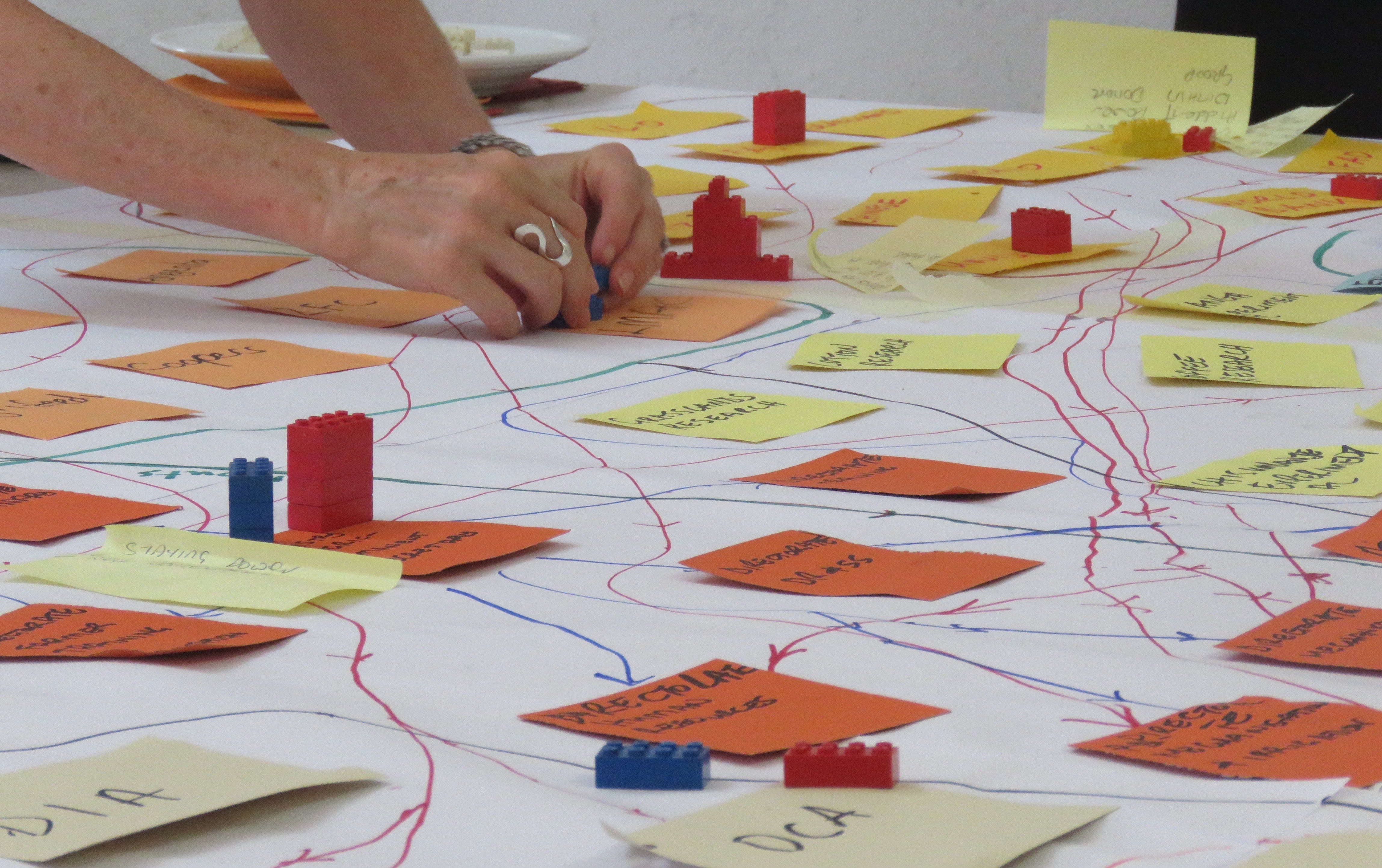
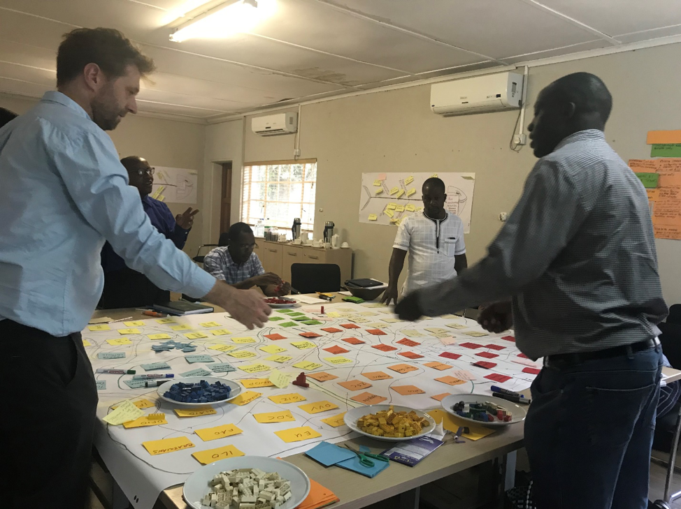
Finally, we used a stakeholder net-map to show the nature and density of links between the agricultural innovation system actors, but also to show power dynamics. Colored cards represented different categories of stakeholder (e.g., education) and specific institutions (e.g., Chibero College). Colored lines between the actor represented flows of information, inputs, and so forth. This is where we got to play with Legos , using the different colors and heights of the blocks to represent the type and amount of power each stakeholder wields within the agricultural innovation system. This exercise revealed several things, including the visible power held by agriculture system donors and the invisible power held by a principle of one of the agricultural colleges—coming from his status as a war veteran, his expertise, and his ethnic background.
Kristin Davis/IFPRI
As we move on to design the centers of agricultural excellence, we now have a much deeper understanding of the system, how its actors are linked, where the power lies, and what the underlying roots of the problems are.
All in all, a fun and rewarding way to spend two days.
Kristin Davis is a Senior Research Fellow with IFPRI’s Development Strategy and Governance Division.
